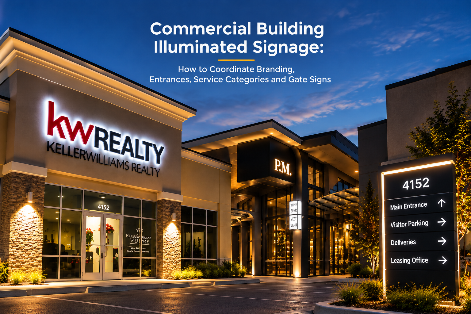
Commercial building illuminated signage works as one system, not a collection of separate signs. You need a hierarchy for master branding, building identity, service categories, entrances and vehicle guidance first. Then you standardize typography, colors, materials, illumination and mounting details across every sign, scaled to each one's actual viewing distance.
Skip that step and you get exactly what most properties end up with: a bright main sign, a mismatched gate sign, and service-category lettering that looks like it came from a different company.
Build the Information Hierarchy Before You Design Any Sign
Start by sorting every sign your building needs into its actual role, not its location. Master branding tells someone what the building is. Service categories tell them what's inside. Entrance and gate signs confirm they've arrived and guide their vehicle. Each role needs a different priority.
Set that priority using decision speed and viewing distance, not personal preference. A driver reading your main identity sign at 60 feet needs large, simple lettering. A visitor walking toward a service entrance at 10 feet can read smaller, more detailed text. Design each sign for the distance it actually gets read from.
| Sign Role | Typical Viewing Distance | Design Priority |
|---|---|---|
| Main identity / road-facing | 30-100+ ft | Largest lettering, simplest message, highest brightness |
| Entrance / gate sign | 10-30 ft | Double-sided visibility, moderate scale, clear directional cue |
| Service category sign | 5-20 ft | Smaller lettering, consistent typography, lower brightness than main ID |
| Wayfinding / directional | 5-15 ft, often walking pace | Icon-forward, minimal text, matched to main brand colors |
Scope note: these ranges are a general starting framework, not a fixed spec. Your actual site plan, traffic speed and building layout determine the real numbers, confirmed during design review.
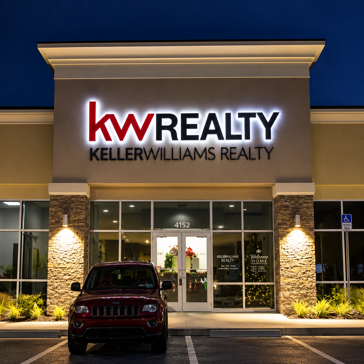
Start by sorting every sign your building needs into its actual role, not its location. Master branding tells someone what the building is. Service categories tell them what's inside. Entrance and gate signs confirm they've arrived and guide their vehicle. Each role needs a different priority.
Standardize the Design Language Across Every Sign Type
Once the hierarchy is set, lock the design details that need to match across every sign on the property. Inconsistent finishes are the fastest way to make a coordinated system look accidental.
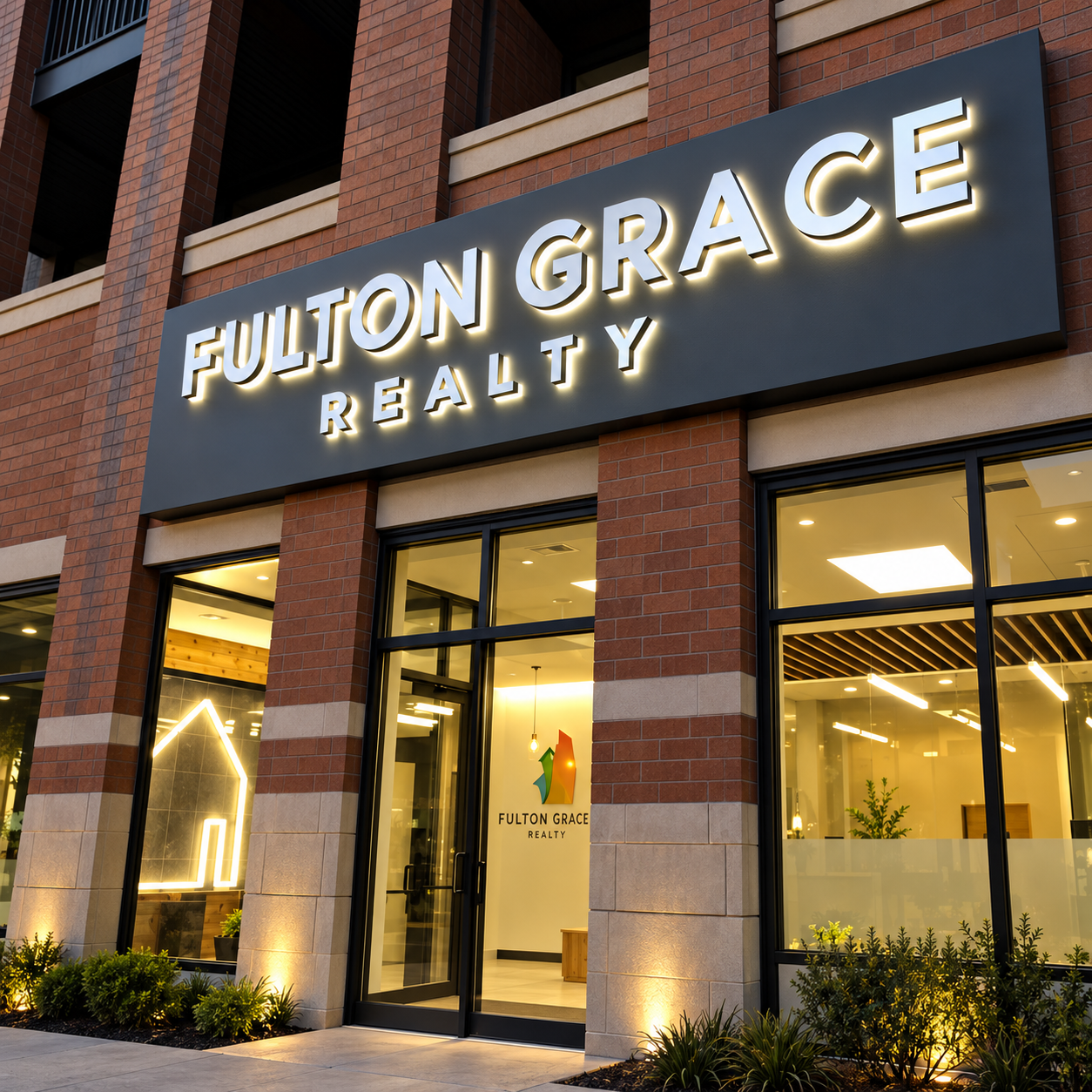
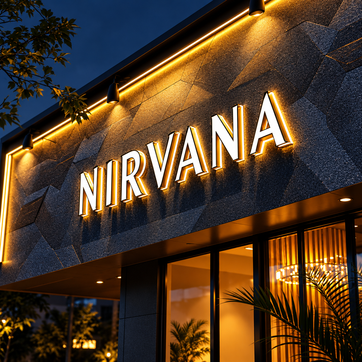
Match illumination color across sign types first. Hicen channel letters and metal signage both offer pure white, warm white or RGB color-changing lighting on 24V waterproof LED modules, so your main identity sign and your service-category signs can run the exact same color temperature instead of an awkward mismatch between warm and cool white.
Use Pantone color matching for anything painted or finished, not a generic "close enough" color from a swatch book. A main sign and a gate sign built months apart, at different times, still need to match exactly, and Pantone matching is what makes that possible.
Finish choices matter just as much. Brushed, mirror, gold, black or painted metal finishes are all available across Hicen's channel letter and metal sign lines, so pick one finish family and apply it consistently rather than mixing brushed aluminum on one sign with painted steel on another.
| Design Element | Coordination Goal | Buyer Check |
|---|---|---|
| Illumination | Consistent lighting appearance | Coordinate color and brightness across sign types |
| Painted / finished colors | Consistent brand appearance | Use Pantone matching |
| Metal finishes | Same finish family | Avoid accidental finish mismatch |
| Typography | Consistent visual identity | Keep the type system coordinated |
| Mounting / construction | Consistent system appearance | Review details across the full sign package |
Optimize Each Sign for Its Actual Location
A road-facing identity sign and an entrance gate sign are solving different problems, even though they're part of the same system.
Prioritize long-distance recognition and a short message on your road elevation. This is the sign drivers see first and read fastest, so it carries your primary brand mark and little else. Save detailed service information for signs people encounter closer to the building.
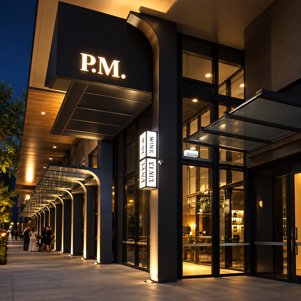
Prioritize directional clarity and double-sided visibility at entrances and gates. Drivers approach these from more than one angle, often while making a turning decision, so both faces need to read clearly and quickly. A gate sign trying to carry too much branding detail slows down exactly the decision it's meant to speed up.
Road-Facing Identity
Primary purpose: Long-distance brand recognition.
Prioritize:
- Large, simple identity
- Short message
- Fast recognition
Entrance / Gate
Primary purpose: Arrival confirmation and direction.
Prioritize:
- Clear direction
- Approach visibility
- Fast decision-making
Validate Day and Night Consistency With One Set of Renderings
A building signage system that looks coordinated at noon can fall apart after dark if brightness levels weren't planned together.
Compare every sign's illumination in one set of renderings before fabrication, not sign by sign after installation. A main identity sign running noticeably brighter than the service-category signs near it can make the smaller signs look like an afterthought, even when the design itself is consistent.
Watch for one sign accidentally obstructing or outshining another too, especially where a gate sign sits close to a taller identity sign. Reviewing the full elevation together catches this before it becomes a fix-it-later problem on site.
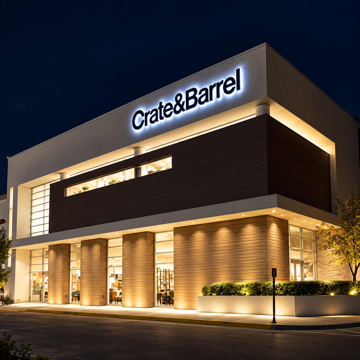
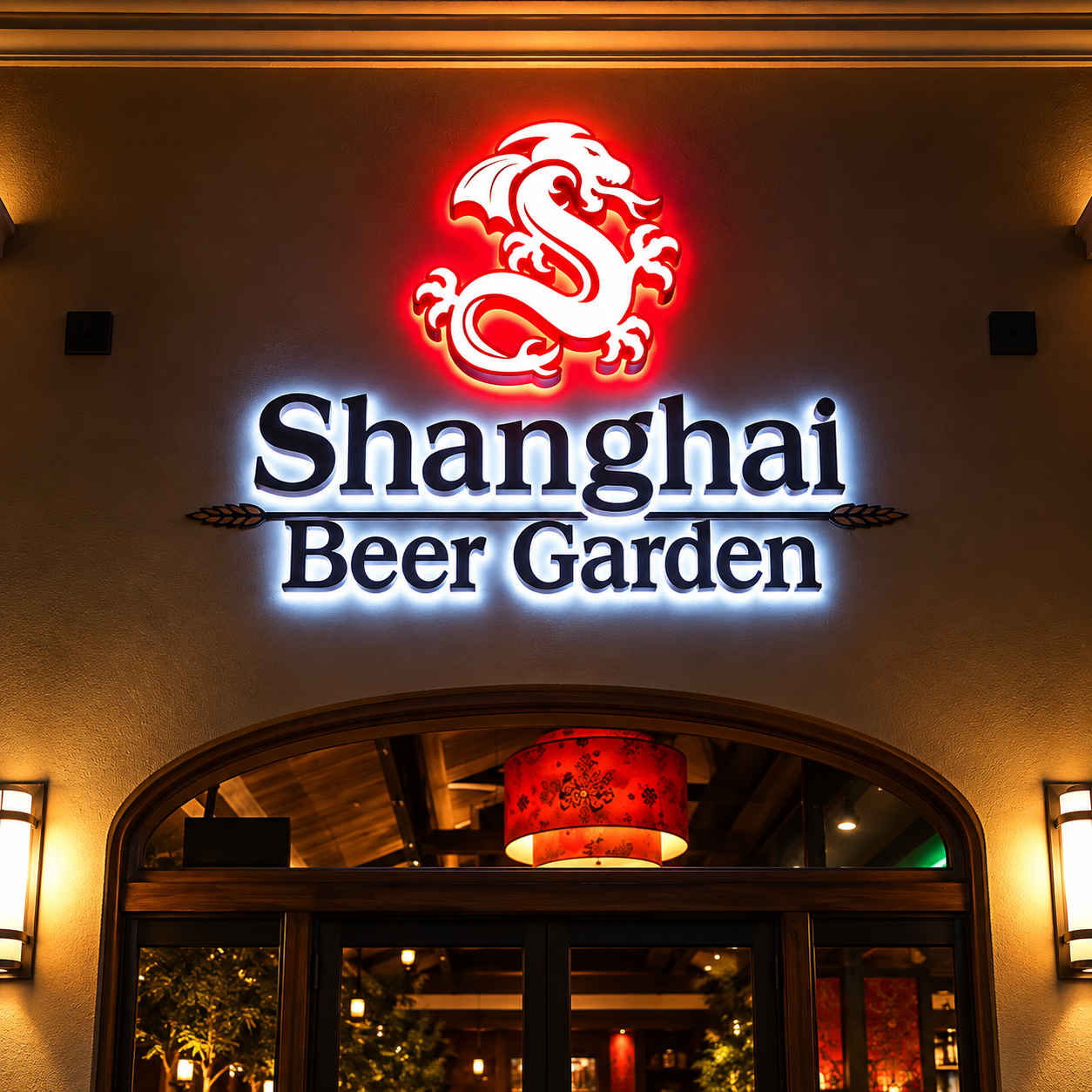
- Main identity visibility
- Entrance and gate visibility
- Relative illumination levels
- Service-category readability
- Potential sign obstruction
- Competing illuminated elements
- Full-building visual consistency
How Hicen Builds a Coordinated Building Signage System
Hicen manufactures channel letters, metal signs and illuminated signage in-house. That's what makes true material and color consistency possible across a full building system.
The same Pantone matching, the same 24V LED modules, and the same backlit or halo-lit options carry across your main identity sign, your entrances and your service-category signage.
Every sign runs through the same 48-hour aging and waterproof testing before it ships. The main sign installed today performs the same as the gate sign installed alongside it.
For a property-wide rollout, we coordinate the full sign package as one turnkey project, with free design renderings so you can review the whole system together before anything gets fabricated.
Frequently Asked Questions
Should every sign use the same brightness?
Not the same absolute brightness, but a deliberately planned relationship between them. Your main identity sign usually needs to be the brightest element, with service-category and directional signs stepped down so they support rather than compete with it. Review your full sign set together, and we can help set that brightness hierarchy before fabrication.
How large should service-category lettering be?
Smaller than your main identity lettering, sized for the closer distance people actually read it from. There's no universal number, since it depends on your building's approach distance and how much text each sign needs to carry. Send us your site layout and we can recommend sizing for each sign in the system.
How can double-sided gate signs avoid excessive depth?
Choosing thinner illumination methods, like edge-lit or slim-profile LED modules, over deeper backlit cabinets keeps a double-sided gate sign from becoming bulkier than the site can accommodate. The right approach depends on your gate's available footprint and how much illumination the sign actually needs. Tell us your space constraints and we'll recommend a construction method that fits.
Get a Coordinated Exterior Signage System
Send us your building elevations and brand files, and we'll develop a coordinated exterior signage system covering your main identity sign, entrances, gate signs and service categories as one consistent design.
Include building elevations, brand files, main identity requirements, entrance or gate requirements, service categories and site layout information with your inquiry.
Request a Signage System Review