This page groups sign concepts by industry, not by how they look in a photo. What decides whether one of these ideas actually works on your building comes down to six factors: viewing distance, the site itself, material, illumination, local code, and ongoing maintenance. Each idea below names the construction and material it actually uses, so you can tell a $200 vinyl banner from a $4,000 illuminated pylon before you fall in love with either one.
A scope note before you scroll: these are practical concepts and material combinations grouped by industry, drawn from common sign types and Hicen’s own product categories, not a documented log of specific installed projects with photos and addresses. Treat each entry as a starting point to adapt, not a finished spec.
Key takeaways
- Six criteria, covered in Section 1, decide whether a sign idea works on your actual building: readability at distance, quick comprehension, exact brand-color match, structural fit, local code compliance, and realistic maintenance.
- Any illuminated or outdoor sign needs a product-specific enclosure or IP rating plus local electrical, structural, fire and accessibility review before installation. No blog page can certify that for your specific address.
- Material choice drives both durability and maintenance cost. The comparison table below sanity-checks the trade-off by category.
- Hicen manufactures, ships and supplies installation documentation and hardware. On-site installation, final electrical hookup, permits and code sign-off stay with your local installer or electrician.
What Makes a Sign Idea Work
Six things separate a sign that performs from one that just photographs well.
Readable from your actual approach distance. A sign people can’t read until they’re already at your door isn’t doing its job. Test it from the sidewalk or the parking lot, not from three feet away in a rendering.
Understandable at a glance. Drivers and pedestrians only get a brief look before their attention moves on, and how much a glance can absorb depends on message length, letter height relative to viewing distance, and how fast they’re moving. A cluttered menu board crammed onto a storefront sign is the classic failure here.
Matches your actual brand colors, not close enough. A logo that’s supposed to be Pantone 286 blue but gets rendered as generic “royal blue” reads as off-brand to anyone who knows your business. Close is worse than obviously different, because it looks like a mistake instead of a choice.
Fits the building it’s going on. A heavy dimensional metal sign on a facade that can’t support the mounting load isn’t a design problem, it’s a structural one. Match the material’s weight and mounting method to what the wall or structure can actually take.
Complies with your local sign code before you fall in love with it. Height limits, illumination restrictions and setback rules vary by city and sometimes by block. A gorgeous pylon sign idea is worthless if your municipality caps freestanding signs at six feet.
Maintenance cost stays reasonable for what you’re getting. A hand-painted or unsealed wood sign typically needs more frequent refinishing than a manufactured illuminated sign, though the exact interval depends on climate, sun exposure and paint quality. An LED-illuminated acrylic sign generally needs less upkeep, but confirm the expected maintenance interval for your climate before you commit to a material. Know which trade-off you’re making.
Material Durability at a Glance
Every idea on this page uses one of a handful of base materials, and the trade-off between upfront cost and long-term upkeep is fairly consistent across categories.
| Material | Typical Use | Outdoor Durability | Relative Maintenance |
|---|---|---|---|
| Aluminum | Channel letters, cabinet signs, pylon structures | High | Low |
| Stainless steel | Premium plaques, architectural letters | High | Low |
| Acrylic (UV-rated) | Illuminated faces, light boxes, pylon panels | Moderate to high, depends on UV rating and sealing | Low to moderate |
| Painted or sealed wood | Interior signage, farm-to-table or craft branding | Low outdoors, better indoors | High |
| Vinyl or printed graphics | Window decals, banners, temporary wraps | Low, fades under UV within months | High, frequent replacement |
| PVC or foam board | Temporary or indoor-only signage | Very low | High, short lifespan |
Exact service life depends on climate, UV exposure, coating quality and maintenance schedule. Confirm expected lifespan for your specific installation before ordering.
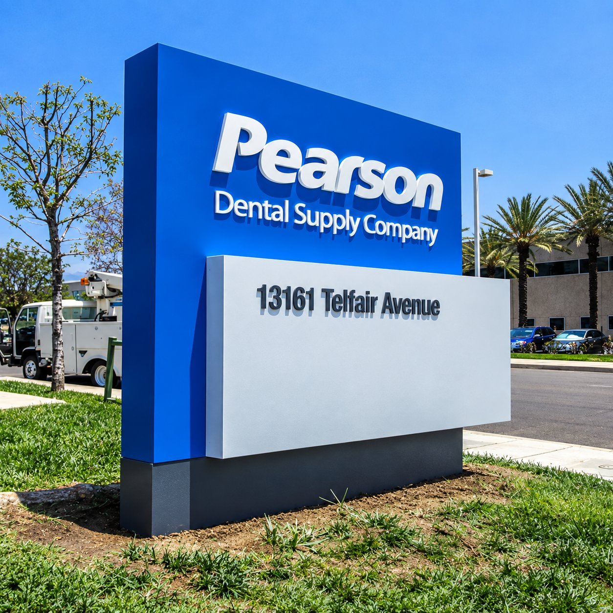
Retail & Storefront Ideas
Storefronts live or die on what a passerby sees in the few seconds it takes to walk past. These ideas cover the range from cheap and temporary to permanent and illuminated.
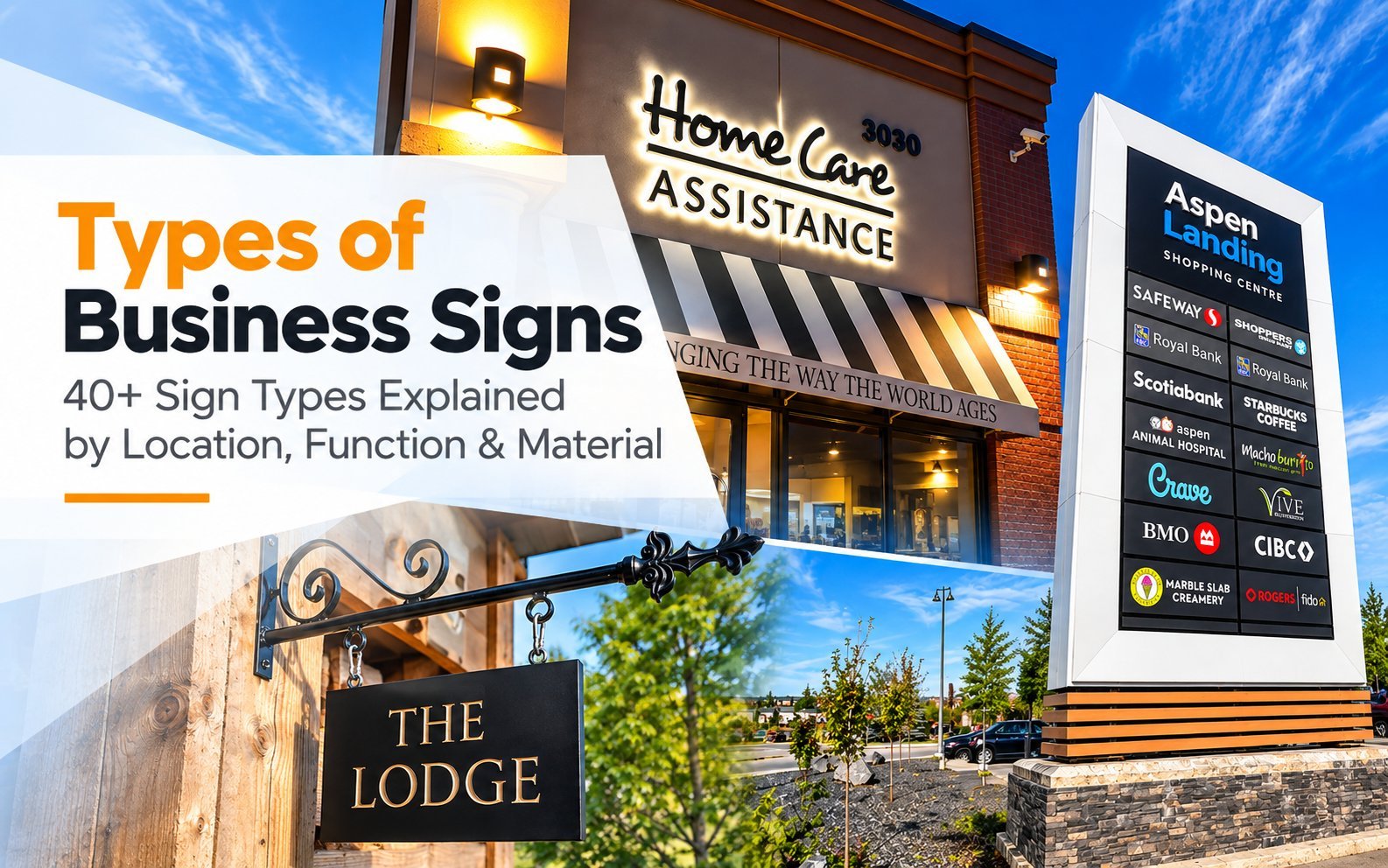
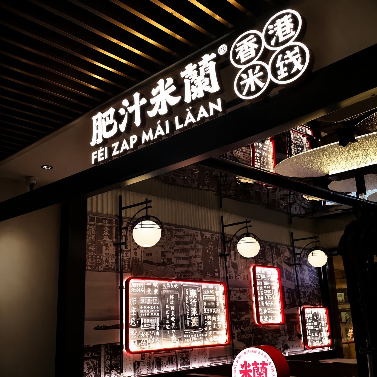
Dimensional channel letters mounted directly on the facade, front-lit or halo-lit, are one of the most widely used permanent storefront identity signs, and the type many customers associate with “real business.”
Acrylic light boxes carry a full-color graphic on an illuminated face, useful when your brand relies on more than just a wordmark. Window vinyl graphics cover hours, promotions or your logo directly on the glass, cheap to install and just as cheap to update.
Hanging flag banners flanking an entrance work well for seasonal promotions without committing to anything permanent. Floor-standing A-frame signs move with foot traffic and cost the least of anything on this list. Halo-lit logo walls inside the entrance reinforce the brand the moment someone steps through the door. Blade signs, mounted perpendicular to the facade, catch pedestrian sightlines along a sidewalk in a way a flat storefront sign can’t.
Illuminated pylon signs suit a standalone retail building set back from the road, where drivers need to spot you before they’re already past the driveway. Backlit awning lettering combines shade and branding in one structure. Brushed or mirror-finish metal plaques by the entrance signal a premium retail experience without needing illumination at all.
Illuminated cabinet signs work well above a storefront where a full graphic panel reads better than individual letters. Storefront address numerals, dimensional and often overlooked, help delivery drivers and first-time visitors find you without circling the block. A seasonal banner bracket system mounted once lets you swap the actual banner for every promotion instead of rebuilding the mounting hardware each time.
A vinyl-wrapped storefront column turns an existing structural post into branded surface area at almost no extra cost. A sidewalk sandwich board sign, distinct from a standard A-frame in its double-hinged build, suits a business that needs to fold and store it indoors every night.
Structure this exercise around what you actually need: a storefront identity, an entrance accent, or a promotional layer that changes seasonally. Custom channel letters cover the first category directly, in-house from design through installation-ready shop drawings. Final on-site installation, electrical hookup and local permit sign-off stay with your installer or electrician.
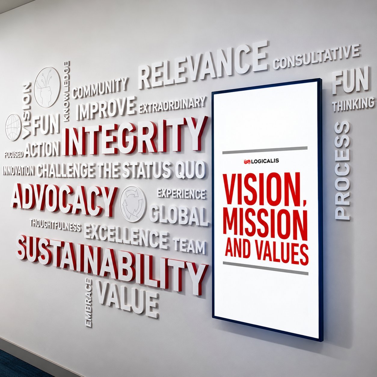
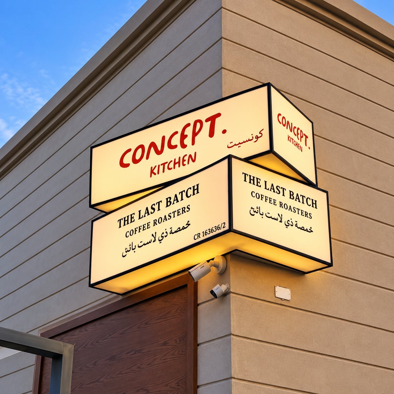
Restaurant & Café Ideas
Restaurants and cafés get more design freedom than most retail categories, since atmosphere is as much a part of the product as the food. A few of these ideas involve electrical or fire-code considerations specific to food service spaces, worth confirming with your local inspector before committing to a layout.
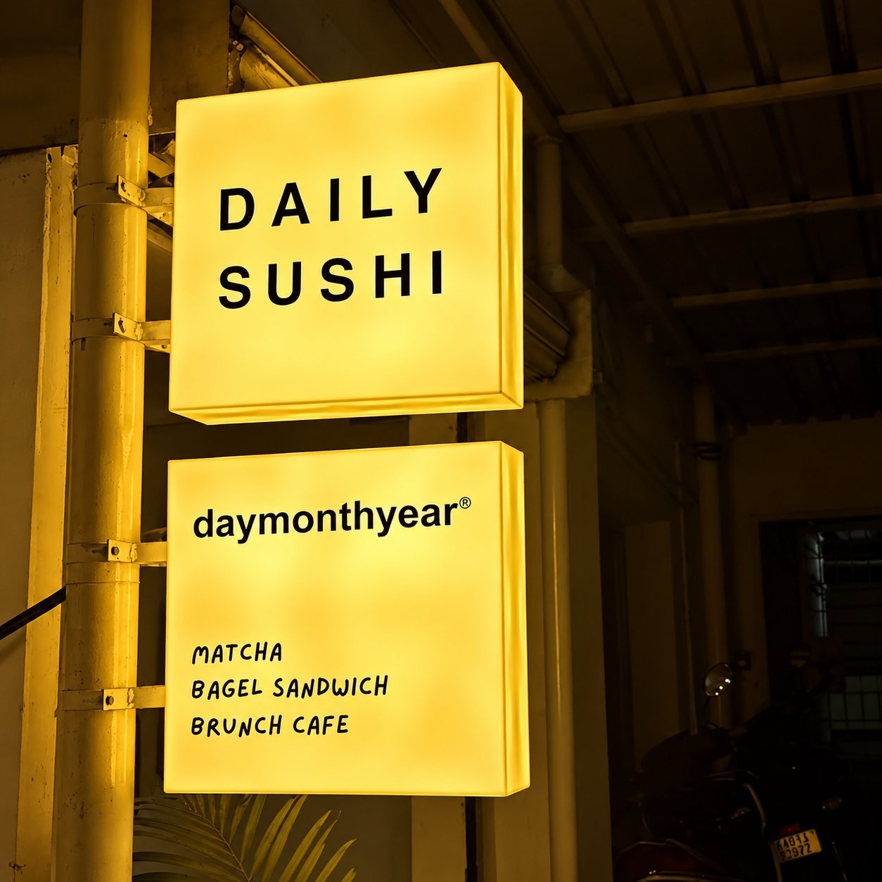
Neon signage, whether a classic “OPEN” script or a full logo piece, is one of the more effective ways to signal a restaurant or bar’s personality rather than just its name. Backlit menu light boxes behind the counter keep pricing legible and easy to update as the menu changes. Wood-and-metal combination signage suits a farm-to-table or craft concept better than anything purely illuminated.
Outdoor patio directional markers guide guests to seating that isn’t visible from the street. Illuminated storefront lettering in warm white reads as more inviting after dark than a cool white equivalent, worth specifying explicitly when you order. Window decal branding on glass frontage works for a quick-service concept that turns tables fast and doesn’t need a heavy permanent sign.
LED channel letters built for night visibility matter more here than in most retail categories, since a meaningful share of restaurant traffic arrives after dark. Hanging pendant-style entrance signs suit a boutique café with limited facade space. Neon-accented logo art inside the dining room extends the same visual identity from the street to the seating area.
Chalkboard-style daily specials signs, whether real slate or a printed look-alike, give you a low-cost way to change messaging daily without touching the permanent signage. An illuminated bar back sign behind the counter does for a bar what a menu light box does for a counter-service kitchen.
Neon window silhouette signs, a simple shape rather than full text, work well for a brand that wants personality without a full script sign. Vinyl awning graphics dress up an existing fabric awning without the cost of replacing the structure underneath it.
If neon is the direction you’re leaning, custom neon signage is built with waterproof outdoor-rated options as well as indoor pieces, so the same look works whether it’s going in a window or over a bar. Confirm the exact enclosure or IP rating for your specific unit and check it against your local electrical and fire code before mounting anything outdoors.
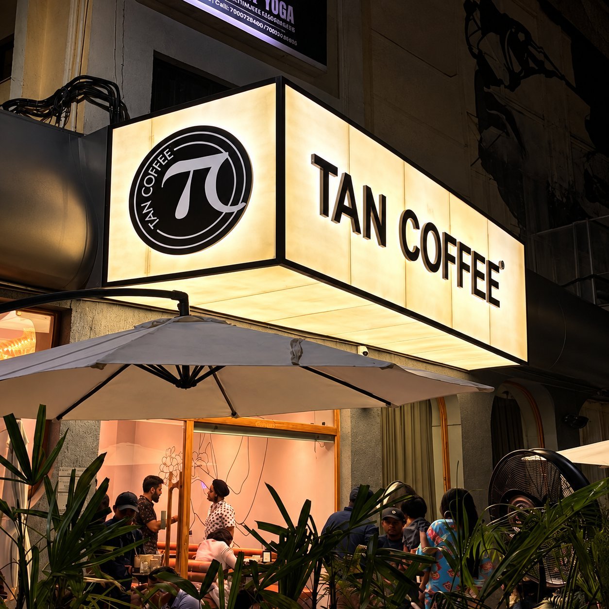
Office & Professional Services Ideas
Office signage rarely needs to grab attention from the street. It needs to look credible up close, guide visitors efficiently, and hold up under years of daily foot traffic.
Lobby logo walls, halo-lit or dimensional, are the first thing a client or candidate sees and set the tone before anyone says a word. Glass door and window film applies your logo or a frosted privacy pattern directly to existing glass, without any structural change to the space.
Floor directory signs in a shared building tell visitors which suite belongs to which company. Elevator lobby wayfinding repeats that information at the point people actually need it, not just at the ground-floor entrance. Suite number signage and desktop nameplates round out the smaller-scale identification most offices eventually need.
Exterior building-mounted letters identify a standalone office building from the parking lot or street, distinct from a lobby sign that only works once someone’s already inside. Reserved parking signage is a small detail that matters more than its size suggests, especially for client-facing businesses.
Wall-mounted department signs help visitors self-navigate a larger office without stopping at reception for every turn. ADA-compliant room identification signs, with tactile characters where required, cover the accessibility side most offices need to get right regardless of building size. A building directory kiosk in a shared lobby consolidates every tenant’s suite number into one sign instead of a dozen small ones.
For anything involving multiple rooms, floors or a shared building, custom wayfinding signage is worth planning as a coordinated system rather than one-off signs added as problems come up.
Hospitality & Large Sites
Hotels, campuses and large commercial sites need signage systems, not individual signs, since the same visitor encounters multiple decision points before reaching their destination.
Hicen’s own project gallery lists comparable systems under names like a hotel illuminated logo directional pylon set, a hotel multi-floor directory wall sign, and a golden hollow-out illuminated hotel entrance pylon. Treat these as naming references for what to ask for, not as photographic proof of any one specific installed project.
Illuminated entrance pylon signs announce a hotel or resort from the road, often the first sign a guest notices pulling onto the property. Multi-floor directory wall signs in the lobby orient guests before they ever reach an elevator. Parking guidance pylons direct vehicle traffic across a site too large to navigate by instinct.
Multi-language wayfinding signage matters for any property serving international guests, and it needs planning at the schedule stage, not as an afterthought bolted onto an English-only sign. Illuminated room number and address plaques carry the same design language from the building exterior down to an individual door.
ADA-compliant restroom and accessibility symbol signs, often in 3D acrylic with tactile characters, are a code requirement in most jurisdictions for public-facing hospitality spaces, not an optional nice-to-have. Exact character size, tactile spec and mounting height still vary by local code, so confirm the specifics with your building authority before finalizing artwork.
Outdoor directional post signs and freestanding directory pylons round out a complete campus-scale system.
Hanging ceiling wayfinding signs stay visible above crowds in a lobby or convention space where floor-level signs would get lost. Elevator and stairwell identification signs repeat critical navigation at the exact decision point where guests need it most. A campus map directory sign near the main entrance orients first-time visitors before they commit to a direction.
A property this size benefits from a coordinated wayfinding manufacturer handling the whole sign family under one specification, rather than a dozen individually sourced pieces that never quite match. Manufacturing, shop drawings and shipping are Hicen’s side of the project. Local codes, permits, structural calculations and final on-site installation stay with you and your local professionals.
Adapting an Idea to Your Brand
Copying the structure of a sign idea is fine. Copying someone else’s brand colors, fonts and logo onto your building is not, and it also just looks wrong once your actual signage goes up next to theirs.
Here’s the useful split: the construction method, the lighting approach and the general layout of an idea are all fair to borrow and adapt freely. Your brand’s specific color, typeface and logo treatment aren’t interchangeable with anyone else’s. That part comes from your own brand assets, not the reference photo that inspired the layout.
If you’re not sure which construction fits your specific building and budget, our signage selection guide walks through the material and lighting trade-offs without assuming you’ve already picked a direction.
Found an idea on this page that fits your business? Send us a reference photo or description and we’ll turn it into a free rendering built around your actual brand.
Frequently Asked Questions
Can I copy a sign idea I saw?
The general structure and construction method, yes. The specific brand elements, colors and logo treatment on someone else’s sign belong to their brand, not yours. Use a reference for layout and construction ideas, then build the actual design around your own brand assets.
Which sign should I do first on a small budget?
Storefront identity first, since it gets seen by the most people for the least ongoing cost. Window and entrance signage comes next. Interior wayfinding and directory signs matter most once your space is large enough that visitors can actually get lost in it.
Which materials survive outdoors?
Aluminum and stainless steel hold up the longest with the least maintenance. Acrylic works well outdoors when it’s rated for UV exposure and properly sealed. Wood and unsealed printed materials fade or warp fastest and suit indoor or short-term use better than a permanent exterior installation.
Do you provide design service?
Yes. Free renderings are part of getting a quote, so you can see the actual design before committing to production.
Does Hicen handle installation and electrical hookup?
Hicen handles design, manufacturing, shop drawings and shipping, plus installation guidance and mounting hardware. On-site installation, final electrical connections, permits and local code approval stay with your installer, electrician or local authority, since those requirements are specific to your address and jurisdiction.
Get a Free Rendering of Your Idea
Found an approach on this page that fits your business? Send us a reference photo or description and we’ll turn it into a free rendering built around your actual brand and building.