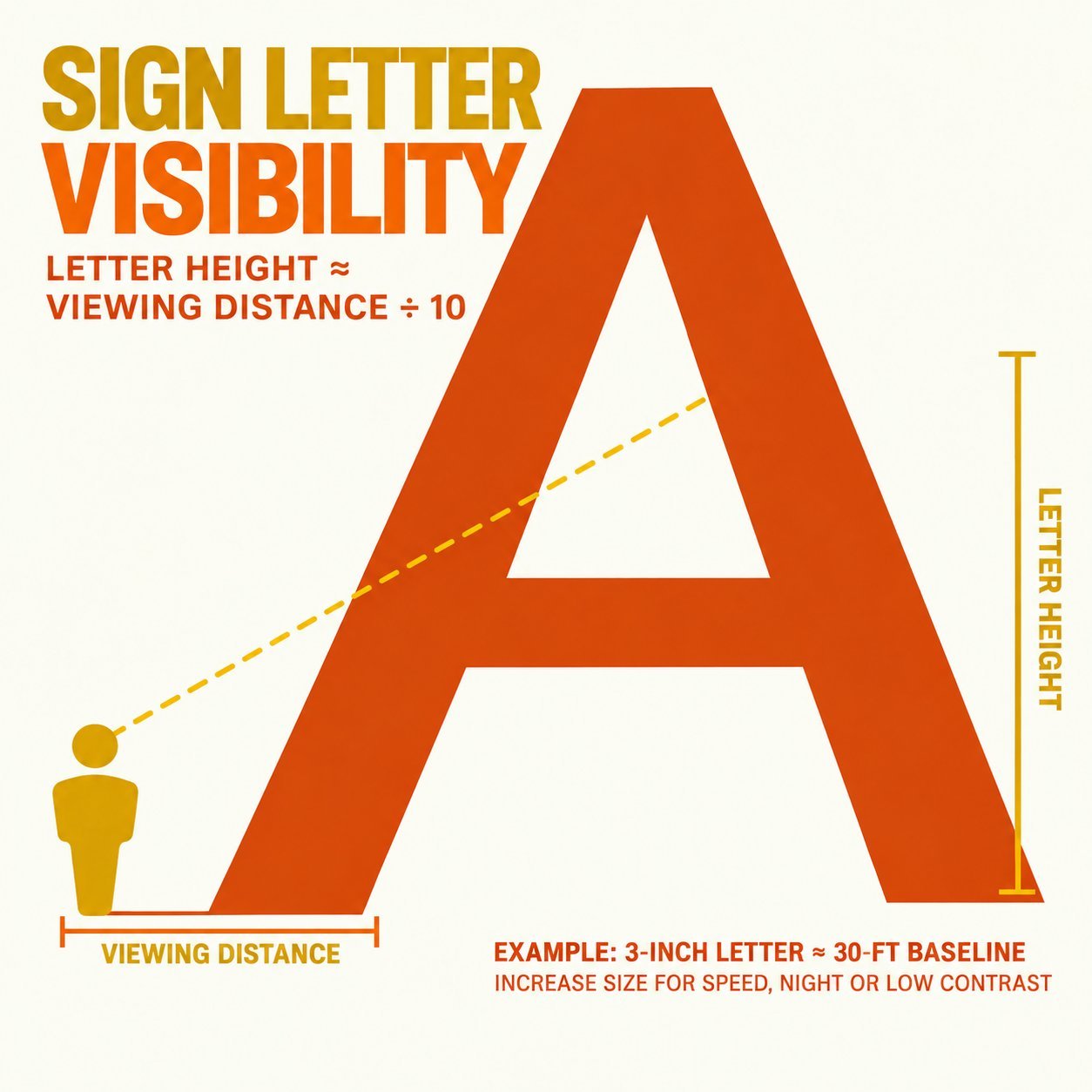
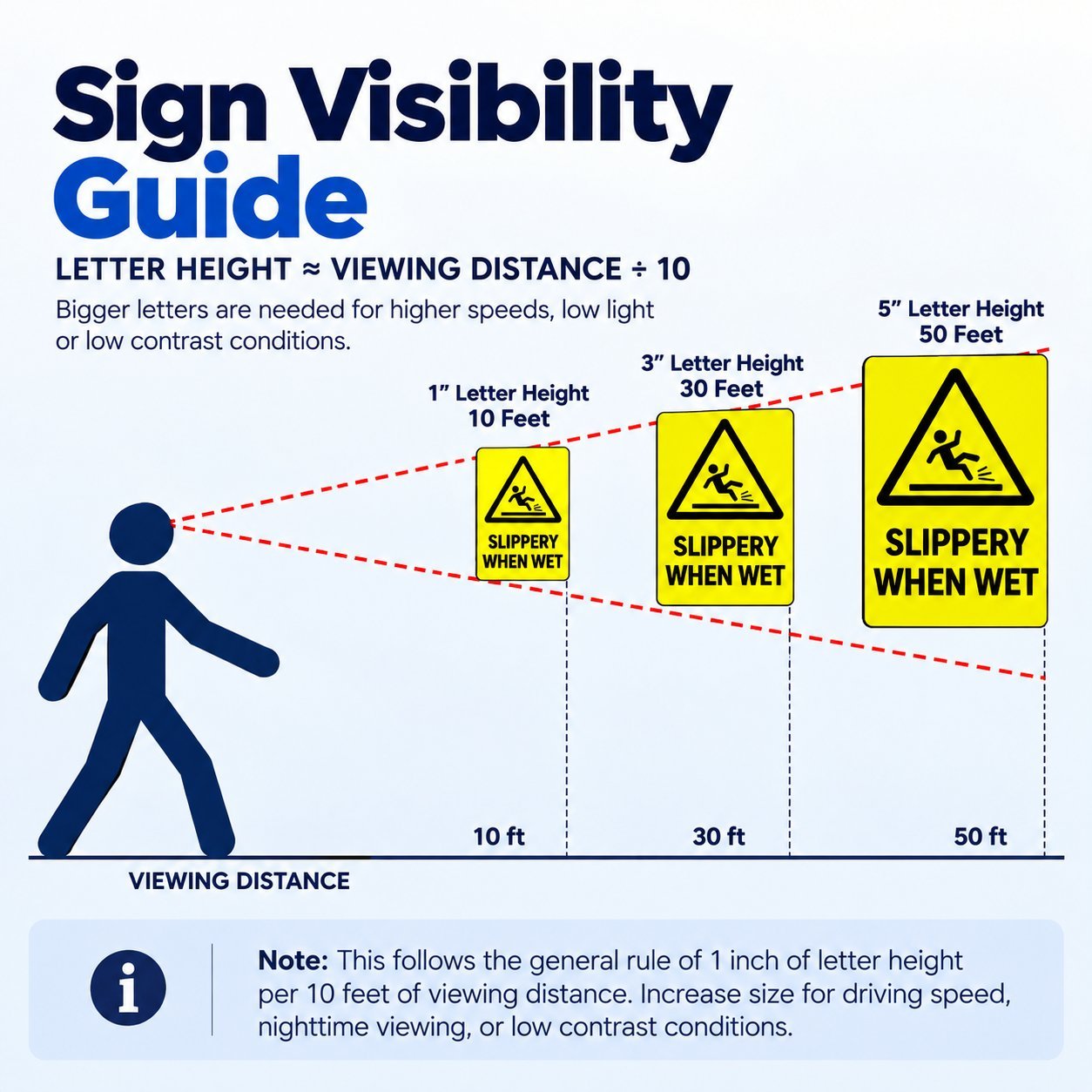
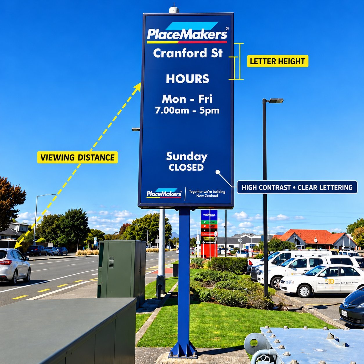
The baseline formula sign designers start from in 2026 is simple: letter height in inches roughly equals viewing distance in feet, divided by ten. That gives you a comfortable minimum, not a hard ceiling.
Speed, lighting and contrast all push that number up from there. The table below converts common viewing distances into a starting letter height before you read the reasoning behind it.
Viewing distance to letter height
| Viewing Distance | Minimum Letter Height | Comfortable Letter Height |
|---|---|---|
| 10 feet | 1 inch | 1.5 inches |
| 30 feet | 3 inches | 4.5 inches |
| 50 feet | 5 inches | 7.5 inches |
| 100 feet | 10 inches | 15 inches |
| 200 feet | 20 inches | 30 inches |
Scope note: this table assumes good daylight contrast and a stationary reader. Driving speed, nighttime viewing and weak contrast all push these numbers higher, covered section by section below.
The 10-Foot Rule and Letter Height Math
The rule of thumb that most sign designers reach for first is roughly one inch of letter height for every ten feet of viewing distance, under good daylight contrast with a reader who isn’t moving fast. It’s a starting point other industry references land close to as well, even when the exact ratio they quote shifts with the conditions they’re testing for.
That’s the operative phrase. The ratio stretches considerably once you change the conditions.
A driver moving at speed reads a sign from much farther back than a pedestrian standing still, so highway and roadside signage designed for fast-moving traffic commonly uses a far more generous readable distance per inch than the ten-foot baseline, sometimes several times more generous under ideal reflective conditions.
Three factors push the baseline ratio in one direction or the other. Reading while driving needs a bigger correction than reading on foot, since a moving viewer has far less time per letter.
Nighttime viewing without direct illumination needs larger letters than the same sign under daylight, since contrast and edge definition both drop after dark. An unlit sign at night needs the biggest correction of the three, since it’s relying entirely on ambient light and reflectivity rather than its own illumination.
Copy the formula as the one line worth keeping: letter height (inches) ≈ viewing distance (feet) ÷ 10, then adjust up for speed, darkness, or weak contrast.
Viewing Distance to Sign Size, by Scenario
The right number off that formula still depends heavily on where the sign is going.
A storefront sign read by pedestrians and slow traffic from the sidewalk or a nearby lane sits closest to the ten-foot baseline, since viewing distance rarely exceeds 50 to 100 feet. A sign set back along a driveway or parking approach needs a noticeable step up, since vehicles cover that distance faster and the driver’s attention is split with the road itself.
A sign meant to be read from a highway or a wide setback needs the largest letters of any outdoor scenario, scaled to both the distance and the speed of the traffic reading it.
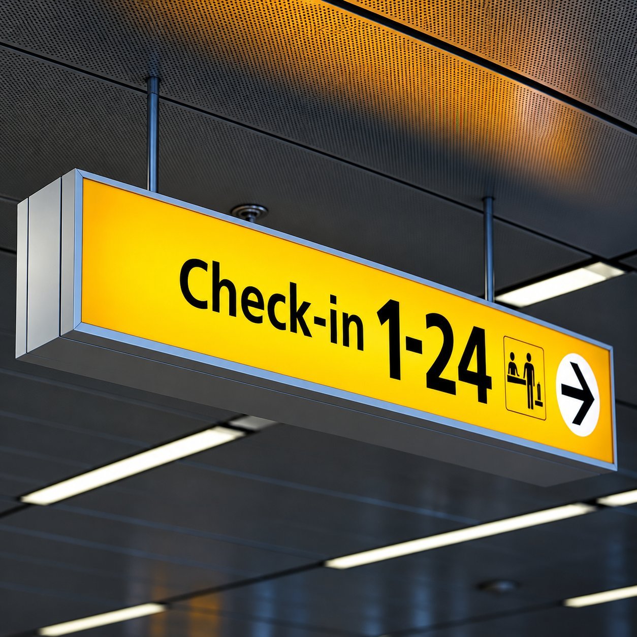
Indoor wayfinding runs on a different logic entirely, since viewing distance is usually short and consistent, but legibility still has to hold up at a glance from someone walking, not standing still to read. Our wayfinding signage guide covers sizing for that indoor, short-distance context specifically.
We’ve deliberately kept this page to the general formula and the scenario logic rather than walking through a specific layout calculation. For a full worked example sizing real letters on a real panel, our face-lit acrylic sign design guide already covers that ground in detail, so this page won’t repeat it.
Contrast Ratios That Survive Daylight and Headlights
Letter height solves half the readability problem. Contrast solves the other half, and it’s the half most buyers underestimate until a finished sign goes up and reads poorly from exactly the distance it was supposed to work at.
The widely cited industry guideline calls for roughly 70 percent contrast between a character and its background, using light-on-dark or dark-on-light rather than two mid-tone colors competing for the same visual weight. That 70 percent figure comes from longstanding accessibility design guidance rather than a single universal legal threshold.
The current ADA standard itself requires light-on-dark or dark-on-light contrast with a non-glare finish without naming one exact percentage, so treat 70 percent as the practical design target rather than a number to cite as law.
Certain color pairings fail this test even though they look fine on a screen or a small sample chip. Red text on a black background reads poorly because the two colors sit close in brightness even though they look visually distinct in hue.
Dark blue on black fails for the same reason, and red paired with green creates a separate problem on top of weak brightness contrast, since that combination is difficult for colorblind viewers to distinguish regardless of lighting.
Here’s the trap that catches buyers specifically: a color combination that looks sharp on a bright showroom sample can lose most of its contrast at dusk, under streetlight, or against headlight glare, since daytime legibility and nighttime legibility aren’t the same test.
A sign that was never meant to light up has no way to compensate once natural light drops, which is exactly why illumination becomes part of the contrast conversation, not a separate one. Our guide to coordinating illuminated signage goes further into how lighting interacts with legibility after dark.
Viewing Time: Vehicle vs Pedestrian
A pedestrian reading a storefront sign has seconds to spare. A driver has a fraction of that, and the faster the traffic, the less copy actually gets read before the sign is behind them.
Industry guidance commonly recommends keeping roadside copy intended for moving traffic to somewhere around five to seven words at most, and fewer still at higher posted speeds. A message that takes longer than that to parse simply doesn’t finish reading before the driver’s attention has already moved on to the road ahead.
For a chain or franchise brand writing storefront copy meant to be read from a vehicle, that constraint belongs in the brief from day one, not as an edit after a design comes back too busy. A short, confident line beats a complete sentence every time a driver is the intended reader.
Sign Codes and Setbacks That Cap Your Size
Everything above describes what makes a sign legible. It does not describe what your local jurisdiction will actually let you build, and those two numbers are frequently different.
Local sign codes and property setback rules set a maximum sign area, height, or letter size independent of readability math entirely, and that legal ceiling wins even when a larger sign would read better from the street.
A municipality’s zoning overlay, a shopping center’s own sign criteria, and a property manager’s approval process can each impose a different limit on the same storefront, and all of them typically have to be satisfied before fabrication starts.
Our guide to commercial property sign approval walks through that approval process and the common reasons a design gets sent back.
This page describes general engineering and design conventions, not a specific jurisdiction’s code. Confirm your local sign code and any property-specific criteria before finalizing a size, since requirements vary by city, zoning district and property, and they change over time.
How to Test Readability Before Fabrication
Math gets you close. A real-world check is what actually confirms a size works before it’s cut, welded or wired.
Three checks catch most problems before production. Print a full-scale paper or foam mockup and tape it up at the actual mounting location, since a size that looked right on a screen can read completely differently against the real wall and surroundings of the building.
Drive or walk the actual approach the real audience will use and see whether the message reads in the time you actually have, not the time you assumed. At night, photograph the mockup location with a phone camera to check for glare, reflection off nearby glass, or a background that swallows contrast after dark.
That real-world check is also the natural point to move from planning into production. Our outdoor signage process walks through what happens from a confirmed size and layout through to a sample and full production.
Confirm your size before you commit to fabrication. Send us your viewing distance, mounting location and any local code limits you already know, and we’ll help you land on a letter height that actually works.
Frequently Asked Questions
How do I calculate sign letter height?
Start with letter height in inches roughly equal to viewing distance in feet divided by ten, then adjust upward for vehicle speed, nighttime viewing, or weak contrast. The viewing distance table above converts common distances directly, and all three adjustment factors push the number up, never down.
What is the minimum readable letter size?
It depends entirely on viewing distance and scenario. Indoor wayfinding read from a few feet away can use letters under an inch tall, while a roadside sign meant to be read from a hundred feet or more at speed needs letters sized in the tens of inches. There’s no single minimum that applies across both.
Which color combinations are most readable?
Dark text on a light background or light text on a dark background, aiming for roughly 70 percent contrast between the two, reads most reliably. Avoid red on black, dark blue on black, and red paired with green, since each of those combinations loses most of its visual contrast under real lighting conditions despite looking distinct on a screen.
How do I make a sign readable at night?
Illumination is the most reliable fix, since it restores the contrast that ambient light removes after dark. A front-lit or halo-lit letter stays legible at night in a way an unlit sign depending on streetlight or headlights simply can’t match. If illumination isn’t an option, reflective or high-contrast materials are the next-best substitute, though neither performs as consistently as a genuinely lit sign.
Can a sign be too large?
Yes. Local sign codes, zoning overlays and property-specific criteria almost always cap sign size independent of what would read best, and that legal limit applies even when a bigger sign would be more visible from the street. Confirm your local code and any property sign criteria before finalizing a size, since the cap varies by jurisdiction and property.
Get Help Sizing Your Sign
Tell us your viewing distance, mounting location, and any code limits you already know.
Not sure what letter height actually fits your viewing distance and local limits? Send us those details and we’ll come back with a size that works before anything goes into fabrication.