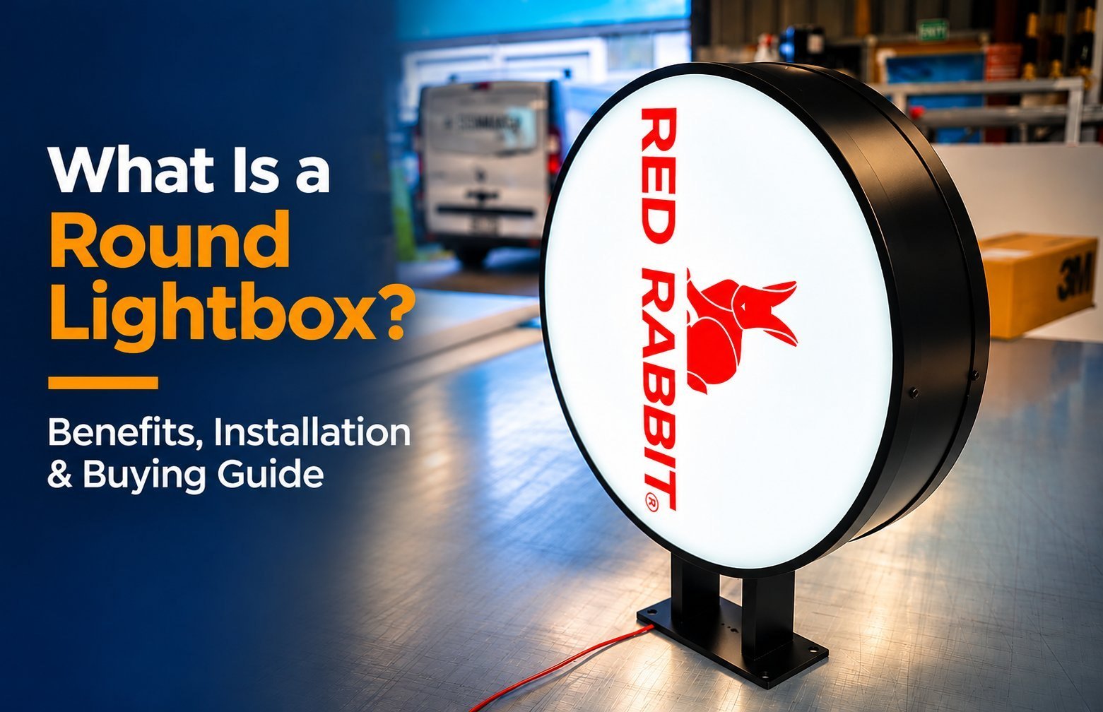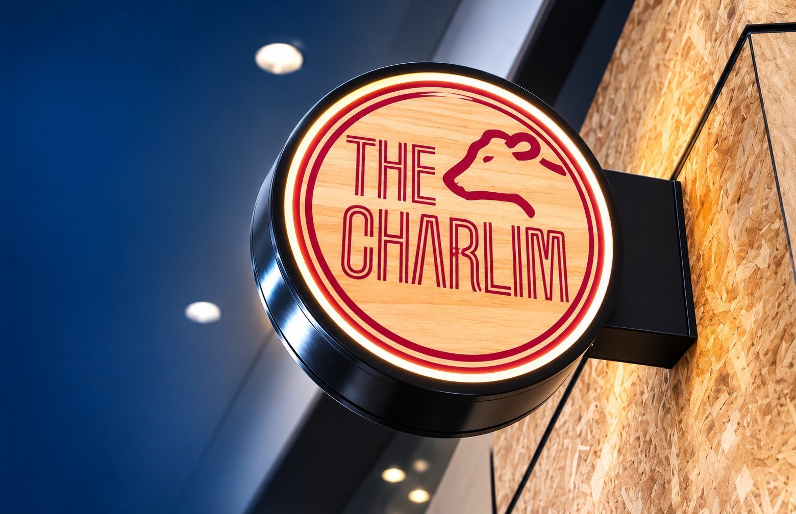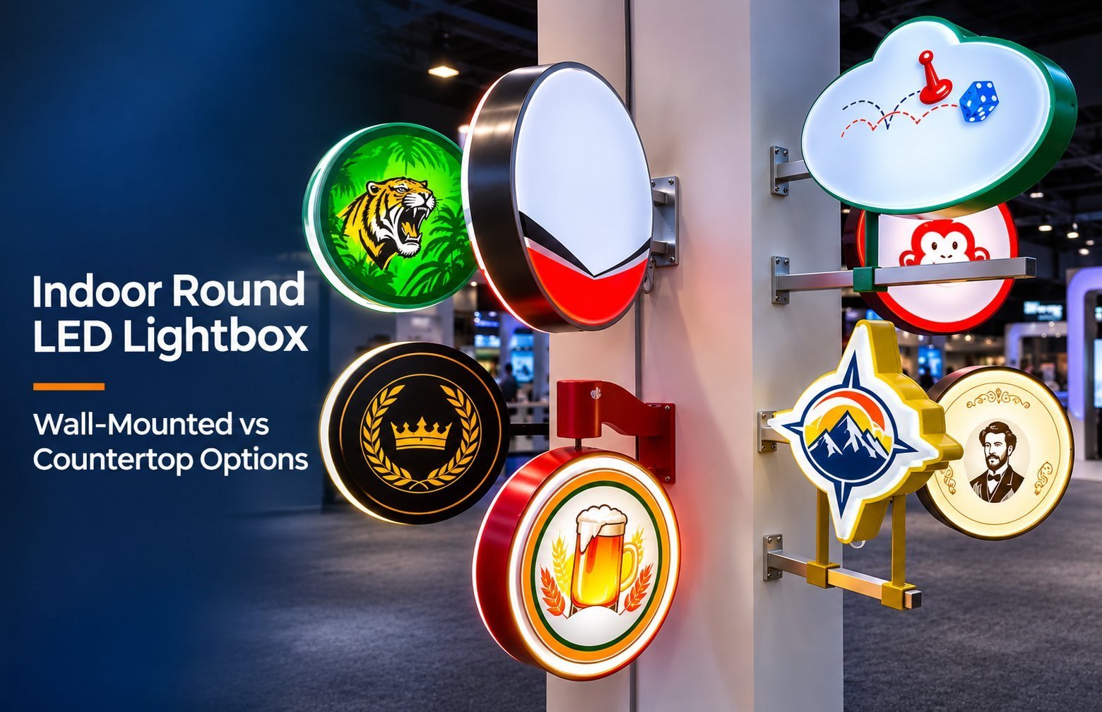
There is no single standard diameter for a round shop sign. Work outward from the artwork and the real viewing positions, then check the space and the rules before you approve a drawing.
The Round Lightbox Sizing Method at a Glance
Work through these steps in order. Each one narrows the range of diameters worth considering.
Measure the usable sign area and the clearances around it.
Check landlord criteria and local limits for this position.
Find where people first notice the sign and where they read it.
Decide what the circle must communicate.
Size the artwork, then fit its full outline inside a circle.
Adjust for mounting height, approach angle and sign configuration.
Convert the visible face size into a cabinet outside diameter.
Preview the result at full scale on the actual shopfront.
Step 1: Measure the Usable Sign Area
Start on site with a tape measure, not a screen. Record the clear width and height of the wall area available for the sign.
Record the space before the shape
Then note everything competing for the same space: door frames, window heads and pilasters; downpipes, vents, cameras and exterior lights; awnings, canopies and existing sign bands; neighbouring signs and shared tenant boundaries.
Leave visual breathing room around the circle. A disc squeezed between a door frame and a downpipe tends to look accidental.
For a projecting sign, measure differently. Record the bracket position, height above the walkway and distance to awnings, plus the gap to any neighbouring projecting sign.
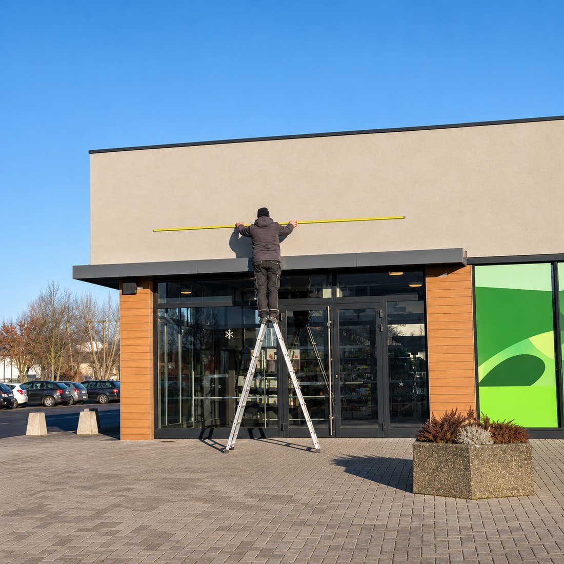
Note the wall build-up and the power location while you are there. Both affect how large and heavy the sign can practically be.
Step 2: Check Site Restrictions Before Choosing a Diameter
Readability tells you the smallest workable size. Site rules often set the largest permitted size. When the two clash, the legal limit wins.
Requirements vary by city, district and property, so check locally at this stage. Common areas to ask about include:
Maximum sign area or diameter on the facade.
Projection distance and height above the walkway.
Illumination limits and operating hours.
Historic or conservation district controls.
Landlord criteria for shape, colour, placement and lighting.
Ask your landlord for the tenant sign criteria now. Confirm with the local authority again before you approve the final drawing. Hicen’s custom logo signs page also notes that permits and final mains connections stay with licensed local professionals.
Step 3: Find Where People Notice and Read the Sign
Two points matter here, and they are rarely the same spot. The notice point is where someone first spots the sign. The reading point is where they need to understand it.
Measure the real approach
Walk the main approaches to the shop and mark both points. Then estimate the distance from each to the sign position.
Pedestrians read slowly and closely, often from the same side of the street. Slow traffic, such as a parking lot approach, reads from farther away. Faster traffic gives a driver only a moment to read.
Hicen’s visibility guide notes that storefronts read by pedestrians and slow traffic rarely exceed 50 to 100 feet. A sign set back from a driveway or parking approach needs a noticeable increase, and the guide suggests around five to seven words at most for moving traffic.

Step 4: Decide What the Circle Must Communicate
A round face suits some content far better than others. Be honest about what your sign must carry before you think about diameter.
| Content on the face | What controls the size | Sizing note |
|---|---|---|
| Symbol or icon only | Recognisable shape at the notice point | Often needs less space than a detailed logo |
| Circular logo or badge | Smallest detail you need people to read | Fine inner text can force a larger circle |
| Short name, one line | Letter height and word length | Long words widen the artwork quickly |
| Longer wording, two or more lines | Line count, line spacing and edge margins | A rectangular box may fit better |
A simple symbol may need less space than a detailed logo. Detail, contrast, lighting and mounting still affect the result. Each extra line of text pushes the diameter up faster than on a rectangle. Only a full-scale preview confirms the final size.
Step 5: Size the Artwork, Then Fit It Inside a Circle
Letter-height guidance applies to lettering, not to the complete round cabinet. Use it to size your text, then build the circle around the artwork.
Hicen’s sign visibility and readability guide gives a comfortable minimum: roughly one inch of letter height per ten feet of viewing distance, based on good daylight contrast and a stationary reader. Night viewing, weak contrast and driving all push the letter height upward.
Once the letter height is set, work outward in this order:
Set the cap height for your most important word or element.
Draw the full outline of the artwork at this scale, both width and height.
Place the whole outline inside a circle on the layout.
Leave clear space between every part of the artwork and the curved edge.
Read off the visible face diameter this layout needs, then add the frame or border to reach the outside diameter.
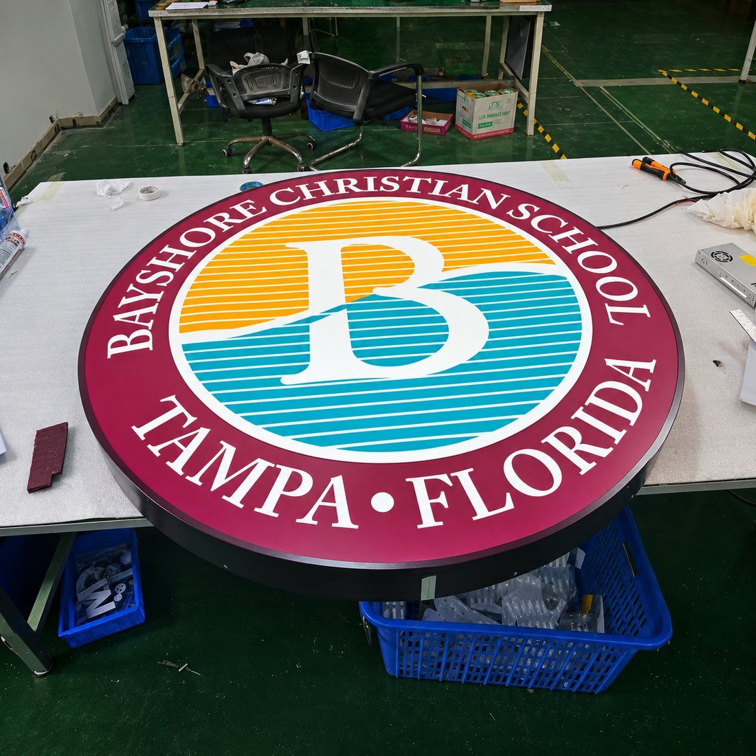

Check width and height together. A wide, short wordmark meets the curve at its corners first. A compact round logo fills the circle more evenly. Ask your designer to confirm the artwork fits with clear space all around.
Letter shape matters too. Thin strokes, condensed fonts and detailed scripts lose definition sooner than bold, open lettering. Hicen’s guide sets roughly 70 percent text-to-background contrast as a practical design target, not a legal threshold.
Step 6: Adjust for Mounting Height, Angle and Configuration
The same circle can look larger or smaller depending on where people stand. Mounting position and approach angle both change its apparent size.
A sign mounted high above eye level is viewed at a steeper angle. From an angle, a circle appears as a narrower oval. The artwork inside it narrows too, so readability drops before the sign disappears.
Configuration changes the viewing pattern:
Single-sided wall face: viewed best head-on, often from across the street. Side approaches see a compressed oval.
Double-sided projecting sign: each face points along the shopfront toward one direction of travel. People walking along the frontage see a face almost straight on.
Single-sided projecting sign: serves one direction only. Traffic from the other side sees the back.
Equal diameters on a projecting sign and a wall face will not read alike. Size each one from its own viewing positions. Hicen’s custom LED light box range lists round as a standard shape and publishes single-sided and double-sided luminous builds with wall-mounted, suspended, freestanding and recessed options. Confirm your exact configuration, including any projecting bracket, in the quote.
Step 7: Separate the Outside Diameter From the Visible Face
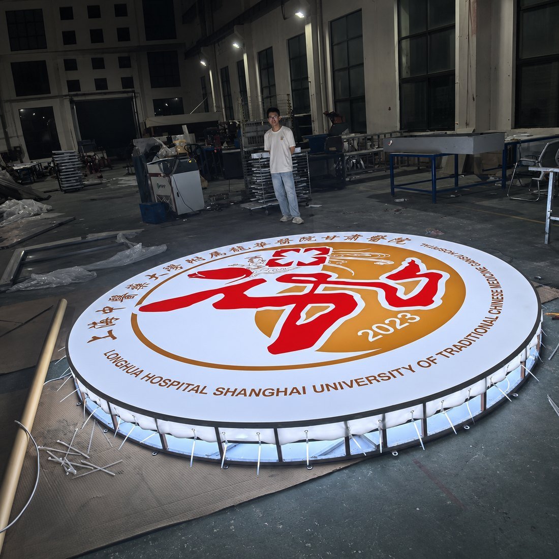
A quoted diameter can mean different things. The frame or border usually reduces the space available for artwork.
| Measurement | What it describes | Why you need it |
|---|---|---|
| Outside diameter | Full width of the cabinet, frame included | Wall space, clearances and approvals |
| Visible face diameter | Illuminated or printed face inside the frame | The real space for your artwork |
| Usable artwork diameter | Visible face diameter minus clear space at both sides | Where text and fine detail belong |
| Depth | Cabinet thickness from wall or bracket | Projection limits and appearance |
| Bracket projection | Distance from wall to the sign | Walkway clearance and approvals |
| Weight | Mass of cabinet and bracket | Fixings and wall capacity |
Ask for both the outside diameter and the visible face diameter on the drawing. Design your artwork to the visible face, not the outside size. Confirm depth, bracket projection, weight and fixing points on the approved drawing too.
Step 8: Preview the Sign at Full Scale
Screens make size decisions look easier than they are. A full-scale preview on the real wall catches most sizing mistakes.
Check it where it will hang
Hicen’s visibility guide recommends taping a full-scale paper or foam mockup in position. Walk or drive the real approach and check the message reads in time.
At night, photograph the spot to check for glare, reflections and weak contrast. For a projecting sign, hold a cardboard circle at the planned bracket position, then walk the frontage from both directions.
If a site visit is not possible, use a correctly scaled photo with a measured reference such as a recorded door width. Scale the artwork against this reference rather than guessing.
Hicen’s custom logo signs page also describes a full-size paper proof taped to the wall to check whether a logo reads clearly before fabrication.
What to Include in Your Round Lightbox Quote Request
A complete request lets the manufacturer check your diameter instead of guessing at it. Pull these items together from the steps above:
- Vector logo file, ideally AI, EPS, PDF or SVG with outlined fonts — see the artwork file guide
- Straight-on wall photo with a measured reference
- Clear sign area, mounting type and any known site limits
- Notice and reading distances
- Wall build-up, power location, quantity and target date
If you have a target diameter, include it as a starting point. Ask for outside and visible face sizes to be confirmed against your artwork. Hicen’s advertising light box page says send your art for a quote in two hours; the general quote guide gives a quote within 24 hours and a free design draft within 1 to 2 hours for a straightforward logo.
Frequently Asked Questions
Is there a standard size for a round lightbox shop sign?
No single size suits every shopfront. The right diameter depends on viewing distance, artwork, facade space and local limits. Treat any catalog size as a starting point to test on site.
Can I use one inch per ten feet to choose the diameter?
No. This rule of thumb sizes letter height, not the complete cabinet. Set the lettering first, draw the full artwork around it, then fit that outline inside a circle.
Should a projecting round sign match the size of a wall sign?
Not necessarily. A projecting face is often viewed by nearby pedestrians along the shopfront, while a wall face is often read from across the street. Each needs sizing from its own viewing positions.
Does a bigger circle always read better?
No. Extra diameter helps only if the artwork inside it grows too. Thin strokes, weak contrast and cramped text still read poorly on a large face.
Why does the visible artwork look smaller than the quoted diameter?
The frame or border takes up part of the outside diameter. Ask for the visible face diameter on the drawing and design to that measurement.
Does Hicen make a round lightbox in a single unit?
Yes. The custom LED light box range states a minimum order of one piece, with standard sizes from 200 × 200 mm to 3000 × 2000 mm and cabinet depths from 30 to 150 mm.
Get a Round Lightbox Size Check From HICEN
Send Your Logo, Photo and Viewing Distances
Send Hicen your logo, a measured wall photo and your viewing distances. Add whether the sign mounts flat or projects from the wall. Hicen offers a free quote and a free design mockup, and its custom LED light box range accepts orders from one piece.