
A two-color face-lit acrylic sign usually fails in one of three ways. Part of the face stays visibly darker than the rest, light escapes at the seams instead of through the letters, or the colors you approved on a screen don't match what actually lights up at night. All three problems trace back to the same three decisions: which acrylic and vinyl you pair together, how the LED modules are spaced behind them, and how the finished piece gets tested before it leaves the factory.
Get those three right and a two-color face-lit acrylic sign reads the same wherever someone looks at it, in daylight, under a streetlight, or lit purely by its own LEDs. This guide walks through each decision in the order you'll actually need to make it, from picking materials through to the test you should ask for before the sign ships.
Start With the Acrylic and Vinyl Combination
A face-lit panel gets its color one of two ways: from the acrylic sheet itself, or from a translucent vinyl film applied over clear or white acrylic. Both routes work, but they behave differently once a light source sits behind them.
White or "opal" acrylic is the standard base for backlit work because it scatters light across the whole panel instead of transmitting it in a direct beam, which is what turns individual LEDs into an even glow rather than a row of visible dots. Opal sheet is graded by light transmission percentage, and that grade is really a spacing decision in disguise. A lower-transmission grade, roughly in the 30 to 40 percent range, hides individual LEDs well in a shallow can but sacrifices some brightness. A higher-transmission grade above 70 percent runs brighter but shows hot spots more easily if the modules behind it are set too far apart. Colored translucent acrylic works the same way, just with less light getting through to begin with, which is why colored panels generally need closer LED spacing than white ones to look equally even.
Vinyl is where a lot of two-color faces actually get their color, and this is a case where the product matters more than the brand behind it. Standard colored or cast vinyl is built to be viewed in reflected light. Put it on a lit sign and it often reads as a dark silhouette at night, because it was never designed to pass light through evenly. Vinyl made for backlit signage is manufactured with a controlled translucency and a defined color when lit from behind, which is why manufacturers publish separate daytime and nighttime color references for it. 3M's Scotchcal translucent film line, sold in more than 75 standard colors, is a widely used example of this category, and it's worth checking that whatever film you're specifying is rated the same way.
There's also a distinct product built specifically around a two-color effect: a perforated film laminate that shows one color in daylight and reveals a completely different backing color once light passes through it at night. 3M markets this as a dual-color film series, intended for backlit channel letters and light boxes, and it needs a clear substrate with a diffuser layer behind it to work as designed. That's a different technique from simply running two ordinary single-color translucent vinyls side by side for two design elements, and it's worth knowing which one you actually need before you specify a film.
Hicen's acrylic sign manufacturing line includes opal acrylic for backlit faces alongside front-lit, halo-lit, edge-lit and push-through illumination options, in nine surface finishes. If dual-color or RGB illumination is part of the plan, its frontlit channel letter line lists dual-color and RGB variants specifically.


| Face construction | Daytime look | Nighttime look | Best suited for |
|---|---|---|---|
| Colored translucent acrylic panel (color molded into the sheet) | Shows the sheet's own color | Glows in roughly the same hue, brightness set by the sheet's transmission grade | Simple single- or two-tone faces where day and night color should stay close |
| White or clear acrylic with translucent color vinyl overlay | Vinyl shows its printed or dyed color | Color can shift slightly lighter or more saturated once backlit, depending on the vinyl series | Multi-color logos that need a documented color match on record |
| Clear acrylic with second-surface (reverse) printed vinyl | Protected color layer reads through the clear face | Light passes through the print from behind | Faces exposed to abrasion, where the color layer needs a protective clear layer in front of it |
| Perforated dual-color effect film | Shows only the surface color | Reveals a different backing color through the perforations | Signs designed to intentionally change color, or reveal a second image, at night |
This table compares the main construction methods used to put two colors on a face-lit acrylic panel. Transmission behavior and the day and night color description come from published acrylic and vinyl manufacturer data, not a single supplier's marketing claim. Confirm the actual shift for your chosen colors with a physically lit sample, since pigment formulations differ between manufacturers.
Approve Colors for Both Day and Night, Not Just One
Daytime color comes from light reflecting off the surface of the acrylic or vinyl. Nighttime color comes from LED light passing through the same material. Those are two different optical events, and a pigment that looks accurate under reflected light doesn't automatically look the same once light is transmitted through it. That's the reason vinyl manufacturers list a day color and a night color for the same product rather than one universal value.
Never approve a two-color face-lit sign from a screen alone. A monitor shows you neither the true reflected color nor the true transmitted color, so ask for a physically lit sample under conditions close to the real install, or at minimum a lit swatch of the actual vinyl or acrylic you're specifying. Hicen's own quality control process describes checking printed panels against confirmed color swatches specifically to control this kind of deviation, which is the same discipline you should expect from any manufacturer producing a color-critical face.
Once you've approved a sample, document three things against it rather than trusting memory or a verbal description on a later reorder:
- The PMS reference, or the closest documented equivalent, for each color you approved
- The exact vinyl series and color number used, not just a color name
- The tolerance you'll accept for color deviation between production runs
If your face uses two different colors, treat each one as its own approval rather than assuming that matching them in daylight means they'll match again once both are backlit. Different pigments transmit light differently, so a pairing that looks correct side by side on a desk can separate once the sign is actually lit.
Set LED Spacing to the Return Depth and Face Color You're Using
Dark spots and hot spots are two sides of the same problem: light isn't spreading evenly between one LED module and the next before it reaches the face. How far apart you can space modules depends mainly on how deep the return or can is, since that depth is the distance the light has to spread sideways before it hits the acrylic.
Sign fabricators and LED module suppliers publish rule-of-thumb spacing ranges for this, built around standard surface-mount LED modules with roughly a 120-degree beam angle:
| Return or can depth | Typical module row spacing | Notes |
|---|---|---|
| 2 to 3 inches | Roughly 3.5 to 6 modules per linear foot | Standard modules crowd too closely at this depth. Shallow-specific or wide-beam modules usually work better |
| 4 inches | About 4 to 6 inches between modules | |
| 5 inches | About 6 to 8 inches between modules | |
| 6 inches | About 8 to 10 inches between modules | |
| 8 inches or deeper | Up to about 12 inches, with high-output modules | Wider spacing trades even coverage for brightness |
These figures come from published spacing guidance from LED module suppliers and sign fabricators, cited in the notes section below, and they assume a standard beam angle. Modules built with a wider beam pattern, sometimes called batwing optics, can cover noticeably wider spacing at shallow depths than a standard module can. Treat the table as a starting point, then confirm the actual spacing against your LED supplier's datasheet and a lit mockup, since output and lens design vary between brands. White or opal acrylic tolerates wider spacing than colored acrylic at the same depth, because it diffuses more of the available light before it reaches the surface.
This is where a two-color face needs extra attention. A darker color absorbs more of the transmitted light than a lighter one sitting right next to it. Lay both colors over an identical LED grid and the darker zone commonly ends up looking dimmer at night, even though the two colors were approved as a matched pair in daylight. Tighter module spacing behind the darker color, a higher-output module in that zone, or a higher-transmission acrylic grade underneath it are the usual ways to bring the two areas back into balance.
Corners and narrow letter strokes need a separate check rather than relying on the spacing you calculated for the open middle of a letter. A row spacing that looks even across a wide stroke can leave a visible gap where a stroke narrows or turns a tight corner, since there's less width for the light to spread into before it reaches the edge.
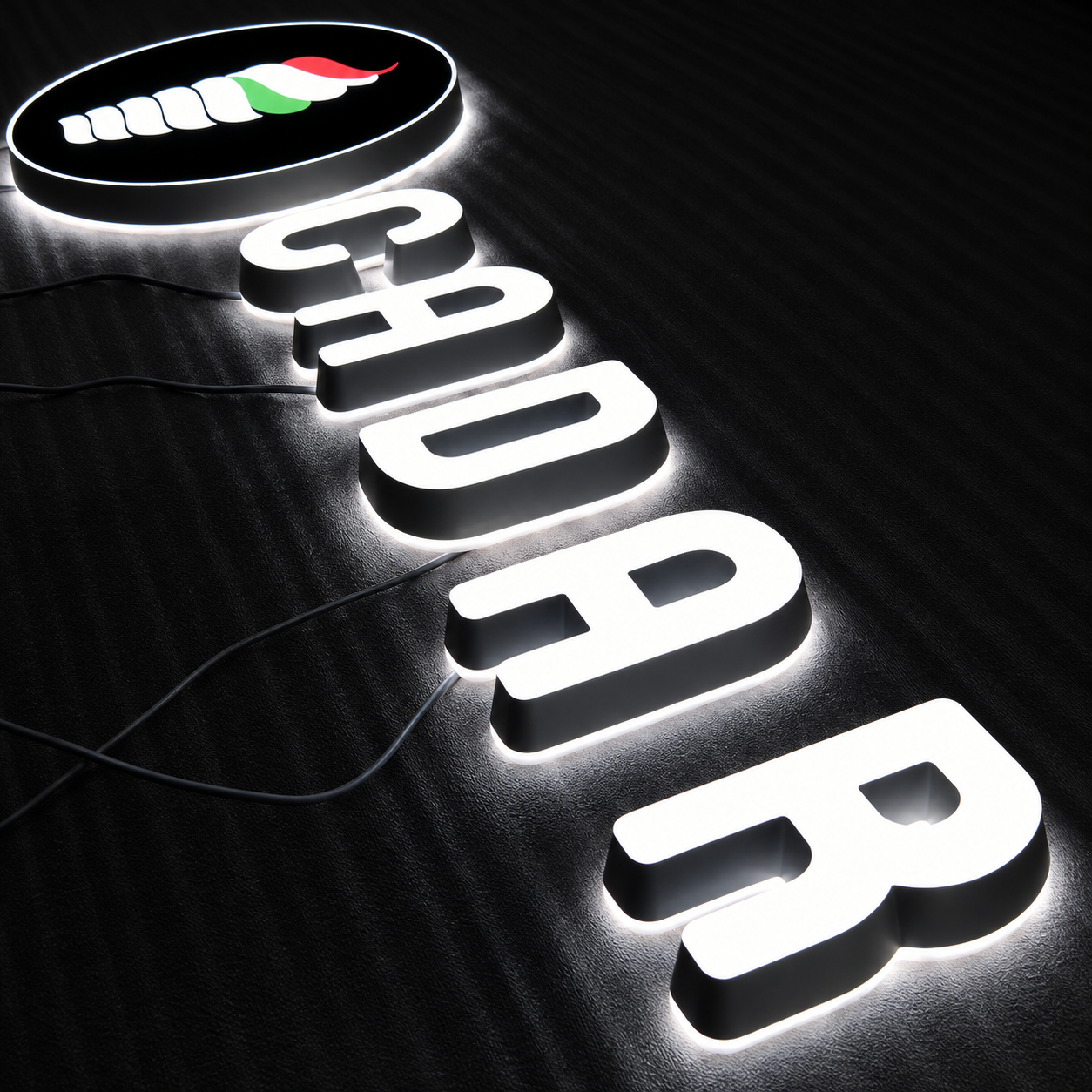

Stop Light Leaks and Shadow Lines Before They Reach the Customer
Light leakage almost always comes from a gap somewhere it shouldn't be: at the seam between the face and the return, at a corner joint, around a wire entry point, or through a loose fastener hole. The fix is mechanical as much as it is optical. A continuous bead of RTV silicone at the face-to-return joint is the standard way to close that seam, and it does double duty since the same seal that stops light from escaping also keeps moisture out. The visible finished edge is typically closed with an adhesive-backed trim cap over the same joint. Backs and returns should fit snugly against each other, since a gap wide enough to see light through in a dark room is also wide enough to let in water over time.
Shadows are a quieter version of the same issue. Wiring, LED module clips, standoffs and fasteners all sit somewhere inside the light path, and if one of them crosses in front of an LED, it casts a visible line or shape onto the face when the sign is lit. Routing those components toward the naturally darker parts of a letter, or behind a return rather than across the open face, keeps them out of view once the sign is powered on.
This matters more on a two-color face than a single-color one. A shadow crossing a flat, single color is easy to miss. The same shadow crossing the boundary between two colors is far more noticeable, since it breaks up a line the eye is already tracking.
What to Prepare Before You Request a Quote or Sample
A manufacturer can move faster, and quote more accurately, with a specific set of information up front rather than a general description. Before you reach out, have the following ready:
- Overall sign dimensions and the return or can depth, or your target depth if it isn't fixed yet
- Both brand colors, ideally as PMS references, plus the vinyl series and color number if you already have one specified
- The mounting surface and available power access at the install site
- Whether the two colors sit in separate zones or overlap, and which one is the darker of the pair
- Your intended nighttime look, whether that's matching the daytime colors as closely as possible or an intentional day-to-night color change
- Any deadline that would require a rush turnaround rather than standard production
Custom sizes, non-standard colors, bulk multi-location orders and unusual mounting are exactly the situations where a manufacturer's input is worth more than a generic spec sheet, since those are the variables that change spacing, material grade and sealing details from one sign to the next.
Test the Sign Before It Ships, Not After It's Installed
A sign that looks correct on a workbench under shop lighting can still show problems once it's actually mounted and running on its own power supply, so the test sequence matters as much as the fabrication itself:
- Photograph the finished face in daylight and compare it directly against the approved physical color sample.
- Photograph it again in a dark room at full LED output, checking every color zone and every corner or narrow stroke for dim patches or visible hot spots.
- If the sign supports dimming, repeat the dark-room check at the lower end of its brightness range, since some uneven spots only become visible once output drops.
- Run a continuous power-on aging test. Hicen's documented process runs this for 48 hours on every finished sign before shipment, checking specifically for early LED failures, flicker or driver faults. Burn-in periods for LED products generally fall somewhere in a 48 to 72 hour range across the industry, so ask your manufacturer what duration they run and what it's meant to catch.
- Check the operating temperature at the driver and inside the can or light box after several hours of continuous operation. This isn't always listed as a separate step, but heat that goes unchecked at this stage is what shortens LED and driver life later, so it's worth asking whether your manufacturer measures it.
- Compare the aged, tested sign against the original approved sample one more time before it's packed, not just once at the start of production.
If you already have your brand colors and a target nighttime look worked out, send them through Hicen's contact page along with your dimensions. From there you can get a recommendation on acrylic and vinyl pairing, a sample, and an illumination test scheduled before full production starts, which is a more reliable way to catch a spacing or color problem than finding it after the sign is already on the wall.

FAQ
How is translucent vinyl different from standard colored vinyl for illuminated signs?
Standard colored or cast vinyl is designed to be viewed in reflected light and is often opaque enough to block most of the light trying to pass through it, so on a lit sign it can read as a dark silhouette instead of a glowing color. Vinyl made for backlit use is manufactured to a controlled translucency that holds a defined color when lit from behind, and manufacturers publish separate day and night color references for it. Confirm any vinyl is rated for backlit or illuminated use before it goes on a face-lit panel.
Why does uneven LED module spacing cause dark spots instead of a smooth glow?
Each module lights the acrylic around it, and that light needs room to spread sideways through the return cavity before it reaches the face evenly. When modules sit farther apart than the return depth allows the light to spread, the space between them stays dimmer than the area directly over each module, which shows up as a scalloped or spotted pattern rather than a flat glow. That's why spacing is set relative to depth and face color rather than used as one fixed number for every sign.
Why can daytime and nighttime colors look different on the same sign?
Daytime color comes from light reflecting off the acrylic or vinyl surface, while nighttime color comes from LED light passing through the same material, and pigments don't respond to reflected and transmitted light in the same way. Some translucent films are built specifically to show one color by day and a different color once backlit, which is an intentional day and night color effect rather than a defect. Whether you want the two to match closely or differ on purpose, approve a physically lit sample rather than assuming the daytime color simply gets brighter at night.
What is opal acrylic, and when should you use it instead of a solid color?
Opal acrylic is a translucent white sheet that scatters light across its whole surface instead of transmitting it as a direct beam, which is what makes it a standard choice for backlit panels and light boxes. Sheets are graded by light transmission percentage, and a lower-transmission grade hides individual LEDs better in a shallow can, while a higher-transmission grade runs brighter but shows hot spots more easily if the modules behind it are spaced too far apart. Choosing the transmission grade is as much a spacing decision as a brightness one.
Do the two colors on a two-color face need different LED spacing or brightness?
Often, yes. A darker vinyl or acrylic color absorbs more of the transmitted light than a lighter one, so if both sit over an identical LED layout, the darker zone commonly looks dimmer at night even though the two daytime colors were approved as a matched pair. Closer module spacing, a higher-output module, or a higher-transmission acrylic grade behind the darker color are the usual ways to bring both zones back into visual balance.
How long should a pre-shipment illumination and aging test run?
There's no single figure that applies across every manufacturer, but a continuous power-on burn-in test commonly runs somewhere in a 48 to 72 hour range before an illuminated sign or LED product ships, long enough for early driver or LED failures to surface before installation. Ask your manufacturer what duration they run and exactly what it checks for, such as flicker, non-lighting sections or driver temperature, since "an aging test" isn't defined the same way by every supplier.