When a storefront sign has to fit inside a fixed 72 × 48-inch panel, layout decisions get harder, not easier. Face-lit acrylic sign design in this size range comes down to five steps: lock the overall dimensions, logo box, and letter heights first; assign space by reading priority; reserve room for the raceway and installation clearances; and confirm readability with scaled daytime and nighttime renderings before anything goes into production.
This guide walks through that process using a common brief: a 72 × 48-inch face-lit acrylic sign carrying a logo box and two lines of text at different letter heights — a layout constraint sign companies, designers, commercial property tenants, and brand managers run into constantly. Along the way, it also covers a few things that rarely make it into a size brief but end up deciding whether the finished sign actually reads well once it’s on the wall.
What Are the Non-Negotiable Dimensions to Lock First?
Before you touch layout, lock three numbers: the total panel size, the logo box footprint, and the letter heights the brand or landlord requires. In a 72 × 48-inch panel, those three constraints — not creative preference — define how much usable space you actually have.
Start by subtracting margins. A face-lit channel letter sign needs consistent edge clearance on all four sides so the layout doesn’t crowd the panel edge, and so there’s room for mounting hardware. Many layouts start with roughly 3 to 6 inches of margin per side as a working assumption, though the real number depends on your mounting method and should be confirmed with your fabricator before you lock the canvas. On a 72-inch-wide panel, even a modest margin can remove 10–15% of your usable width — space that has to come out of the layout, not out of the margin, once production begins.
Logo box sizing follows the same logic. As a general starting point, a logo box often occupies somewhere between a quarter and a third of the panel’s total width, leaving the remainder for the two lines of text — but this should flex based on how visually dense the logo itself is. A simple wordmark logo can sit in a smaller box than a detailed emblem without losing legibility.
Only after the usable area is defined should you move into creative layout. Skipping this step is the most common reason revisions happen late: a design gets approved, then doesn’t actually fit once real-world margins and mounting requirements are applied.
How Do You Build a Clear Visual Hierarchy in a Fixed Panel?
A logo, a primary name, and a secondary line of text aren’t interchangeable — each needs a distinct reading level so the sign communicates in the order a passerby actually processes it: logo first, primary name second, supporting text last.
Letter height is the simplest tool for building that hierarchy. In the brief used here, a 10-inch letter height for the primary name and a 6-inch height for the secondary line creates roughly a 1.6:1 size ratio — enough contrast that the eye knows which line to read first, without needing extra color or spacing tricks to do the work. This kind of channel letter layout matters more in dimensional, illuminated signage than in flat printed graphics, because channel letter signs read differently at a distance than they do on a screen.
Stroke width matters as much as height. A thin, elegant typeface might look refined in a digital mockup, but dimensional face-lit letters lose fine detail at a distance faster than flat print does — a heavier stroke weight typically holds its shape and legibility better once it’s cut from acrylic and lit from behind. If the brand’s logo uses a light or script typeface, it’s worth testing a slightly bolder version specifically for the sign rather than reproducing the print logo stroke-for-stroke.
Resist the temptation to make every element as large as the space allows. A sign where the logo, primary name, and secondary text all compete at similar visual weight reads as noise, not hierarchy — even if every individual element is technically legible.


How Do You Test Real-World Viewing Distance?
A layout that looks balanced on a monitor doesn’t always hold up at 50 feet, in daylight, or in a driver’s peripheral vision. Before finalizing a design, run it through scaled renderings that simulate both pedestrian and vehicle viewing angles.
A widely used starting rule in sign design is that legible viewing distance scales at roughly 10 feet per inch of letter height under good contrast and lighting conditions. Applied to the example used throughout this guide, that puts a 10-inch primary line in a comfortable reading range around 100 feet, and a 6-inch secondary line around 60 feet — which is exactly the kind of gap you want between a name meant to be read from across a parking lot and supporting text meant to be read closer in. Treat this ratio as a starting point rather than a guarantee, though: actual legibility still depends on font weight, letter spacing, color contrast, and how the sign is lit, so it’s worth confirming with a scaled rendering rather than the formula alone.
That distinction also matters for where the sign will actually be seen from. A sign facing a sidewalk is mostly read at close, slow-moving pedestrian distances, while a sign facing a road is read by drivers approaching at speed from much farther away — the same 72 × 48-inch layout may need different letter-height priorities depending on which audience it’s designed for first.
At the rendering stage, check three specific failure points for sign readability: strokes thin enough to disappear at a distance, letter spacing tight enough to blur letters together, and logo details fine enough to lose definition against the acrylic thickness and lighting. These issues are usually invisible on a screen and only show up once the design is scaled against real sight lines.
What Fabrication and Installation Space Do You Need to Reserve?
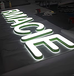
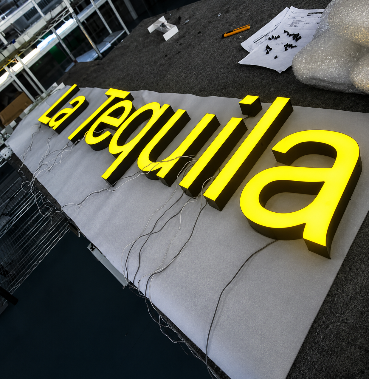
A layout that fits on paper doesn’t automatically fit in production. Face-lit acrylic letters need internal depth for metal returns, and the sign as a whole typically needs a raceway to house wiring and power connections — components a flat digital mockup can hide but a fabricator can’t skip.
Aluminum letter returns commonly run in the range of about 3 to 5 inches deep for letters in this size range, and raceways built to house drivers and transformers are commonly designed in the 3-to-6-inch depth range as well, though larger installations can run deeper. None of that depth shows up in a flat rendering, but it directly affects how far the sign projects off the wall and how much structural backing the mounting surface needs to support. Hicen’s channel letter manufacturing process reserves this space at the fabrication stage specifically because layouts finalized without it are the most common cause of last-minute redesigns.
Concealed fasteners and mounting points also need dedicated clearance, particularly at 72 × 48 inches, where the sign’s own weight and — for outdoor installations — wind load affect how many mounting points are required and where they can go. A panel this size on an exterior wall is enough surface area that mounting isn’t just a finishing step; it should be planned alongside the layout, not figured out after the design is approved.
What Should Approval-Ready Drawings Include?
Once layout, hierarchy, and fabrication space are settled, the sign needs to move into a drawing a client, landlord, or permitting office can actually approve — not a rendering alone.
At minimum, that drawing should show overall width and height, the letter height for each line, and the mounting position relative to the wall or panel. Beyond dimensions, a complete approval package typically also specifies exact colors or finishes (by Pantone or RAL code rather than a description like “brand blue”), the LED color temperature, and a basic wiring/mounting diagram — details that are far cheaper to settle on paper than to change after fabrication starts. Pair the drawing with both daytime and nighttime renderings, since a face-lit sign’s readability changes once the LEDs become the primary light source rather than ambient daylight.
This is also the stage to confirm material and finish choices — see this signage material comparison if acrylic, aluminum, or a mixed-material return is still under discussion — along with LED specification against your layout; Hicen’s guide to LED chips and power supplies covers what to request from a supplier before finalizing. Drawings should also be checked against your fabricator’s quality control process — Hicen runs incoming material inspection, in-process monitoring, and pre-shipment verification as part of a five-step closed-loop system — so nothing gets adjusted after fabrication has already started. It’s also worth checking local permitting requirements early: many jurisdictions require a permit for illuminated exterior signage, and requirements vary enough by city and property type that this should be confirmed locally rather than assumed.
Common Mistakes When Laying Out a 72 × 48-Inch Face-Lit Sign
A few patterns show up often enough in this size range that they’re worth calling out directly, separate from the step-by-step process above.
- Designing to the full panel, then shrinking everything later. It’s tempting to lay out a logo and two lines of text across the entire 72 × 48-inch space and only account for margins afterward. That almost always forces a last-minute scale-down of every element, which quietly erodes the visual hierarchy you designed in the first place.
- Giving the logo and the text equal visual weight. Without a clear size or emphasis difference, a sign reads as a block of information rather than a name a passerby can register in a second or two — which is often all the attention a storefront sign actually gets.
- Choosing a typeface that wasn’t built for dimensional letters. A font that reads well printed on paper doesn’t always translate cleanly into cut acrylic and metal returns, especially at thinner stroke weights or tight letter spacing.
- Skipping the nighttime rendering. A layout that’s approved from a daytime mockup alone can look noticeably different once the LEDs are the dominant light source — by then, changes are far more expensive than they would have been at the drawing stage.
- Finalizing the design before confirming mounting capacity. A 72 × 48-inch illuminated sign has real weight and, outdoors, real wind load. Confirming the wall or structure can support it should happen alongside layout decisions, not after the design is already signed off.
Frequently Asked Questions
What letter size works for a 72 × 48-inch sign area?
There’s no single fixed answer — it depends on the logo box size and how many lines of text the layout carries. As a starting reference point, a two-line layout (primary name plus secondary line) in this panel size often works with a primary letter height around 10 inches and a secondary height around 6 inches, once margins and the logo box are accounted for. The right numbers for a specific sign should be confirmed against the actual logo file and intended viewing distance, not applied as a fixed template.
How much margin should an illuminated sign layout include?
Margins should be set before layout begins, not adjusted afterward to make elements fit. Many layouts start with roughly 3 to 6 inches per side as a working assumption, but the exact clearance depends on the mounting method and any raceway or fastener requirements, so confirm this with your fabricator’s manufacturing process before finalizing dimensions — it’s easier to design within an established margin than to retrofit one later.
Can the logo box and letters share one raceway?
In many layouts, yes — a single raceway can house the wiring for both the logo box and the letter set, which simplifies installation and keeps wall penetration to one point. Whether that works for a specific sign depends on the power draw of the LED components and the layout’s overall width, so it’s worth confirming with your manufacturer’s channel letter build process rather than assuming it by default.
How far away can a 10-inch or 6-inch letter actually be read from?
As a general starting rule, legible viewing distance runs at roughly 10 feet per inch of letter height under good lighting and contrast — meaning a 10-inch letter is commonly readable from around 100 feet and a 6-inch letter from around 60 feet. Treat this as a planning guideline rather than a guarantee, since font weight, spacing, color contrast, and lighting all shift the real number, and it’s worth confirming with a scaled rendering for your specific sign.
How long does production take once a design is approved?
Timelines vary by fabricator and order complexity, but as a general reference point, custom frontlit channel letter production commonly runs around 2–3 weeks following final design approval. Confirm the specific timeline with your manufacturer once the drawing is locked, since material availability and order volume can shift it.